

JW Tek recently took part in the new logo design for Quantum Services Group, more commonly referred to as QSG. QSG is the parent company of Quantum Data Center and JW Tek. Our designer Katie managed this design and this blog post will walkthrough her design process, a later post will discuss how the logo was developed in Adobe Illustrator.
KICK OFF
After speaking with Andrew (Quantum Data Centers) and Eli (JW Tek) we discussed a few ideas, our original idea was merging both JW Tek and Quantum Data Center logos in some way to create the QSG logo. Other than that I had creative freedom.

First I had to determine whether I wanted to create an Acronym Logo and only style the letters, or if I wanted to create an abstract visual icon to represent the brand. In the beginning I was focused on an Acronym Logo that represents the brand and merges QDC and JW Tek:

But as I continued working on this method I found the QDC and JW Tek colors and styles were clashing, nothing stood out to me here, and I decided to go the icon route. I started with a word map to determine the keywords I associate with QSG and started sketching from there. The keywords that stood out to me were “Change, Growth, Global, Services, Tech, and Expanding.” I drew a few styles that I liked, some with a tech feel, others with a global style. My two favorites were starred.

From here I really liked the idea of the globe with pieces breaking off or building together (either interpretation can represent QSG). I started working on it in illustrator and messed around with different shapes. Originally I went with square for the makeup of the globe.


I felt like I was getting very close to the logo style I wanted, but I still wasn’t sold on the QDC and JW Tek colors together, so I started looking into color theory and decided to go with an orange gradient globe. Orange represents enthusiasm, creativity, determination, success, and stimulation; all characteristics of QSG as a growing company. I chose triangles (delta) to represent change as QSG companies are constantly evolving over time.

The final colors are a tribute to QDC and JW Tek colors on a darker scale. The blue (JW Tek) and green (QDC) fit well with the darker theme for QSG with a vibrant orange.

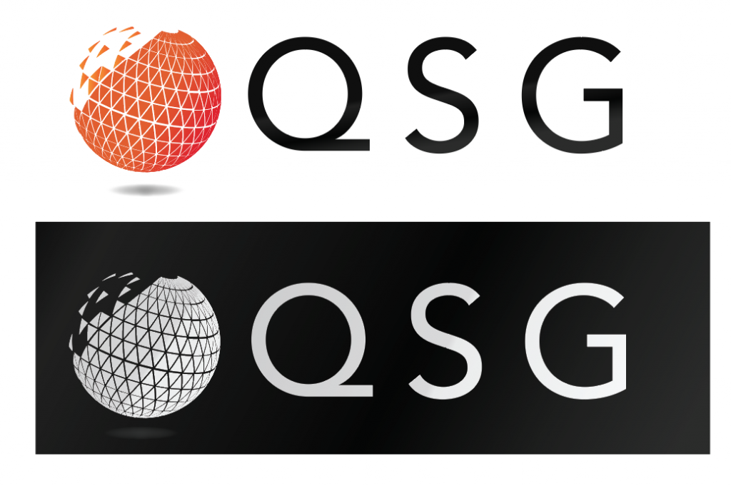
The final logo in two forms:

The end product features secondary variations such as a single color globe for use in specific circumstances (not shown, simply orange instead of the gradient) and being reversed out of a dark background. I also adjusted the kerning to even out the logo. The font we decided to use was Avenir because it has a clean, modern look and feel.