

What is a responsive website?
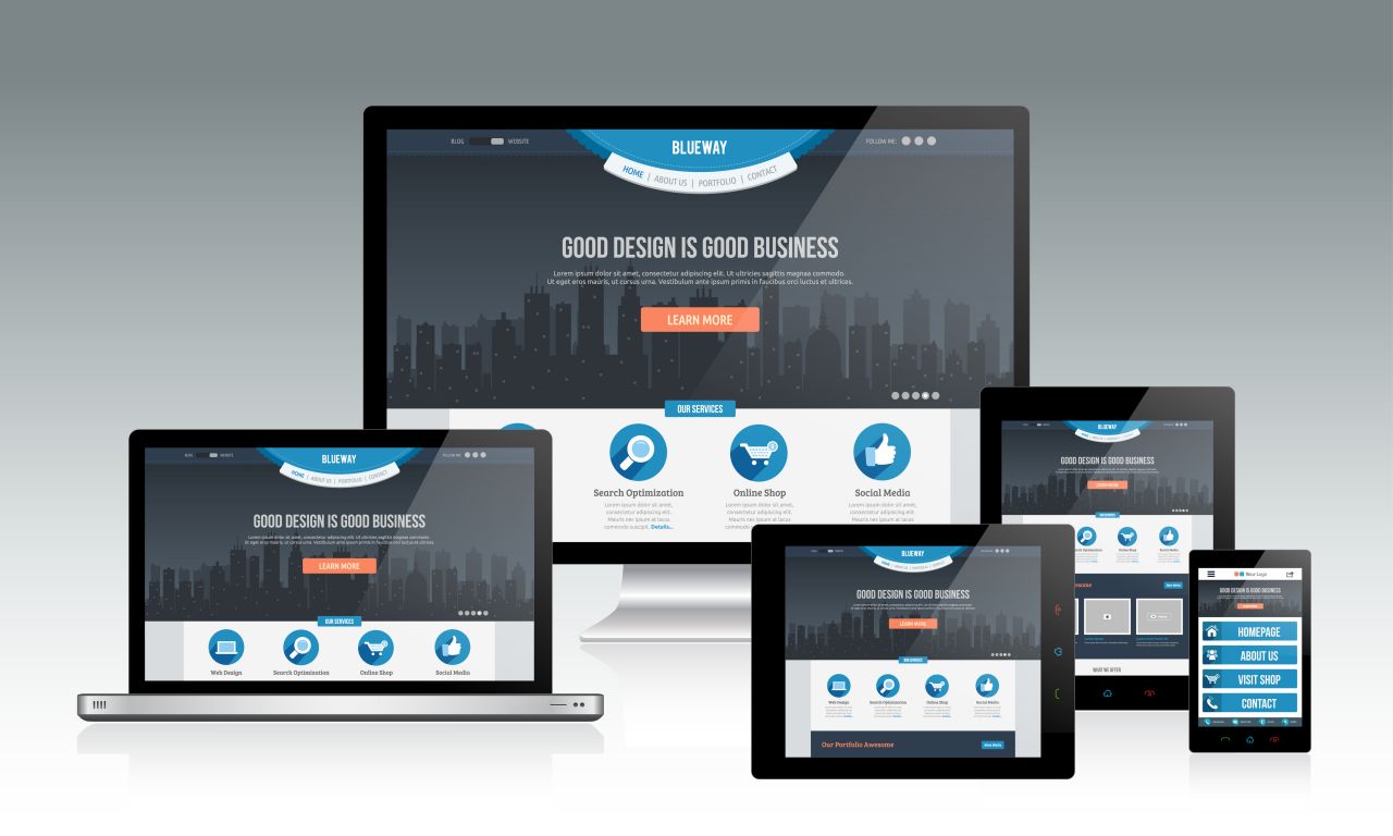
A responsive website is one that scales to fit all device screen sizes. Simply put, it is both functional and formatted correctly on every device a person is using to access your website. This ensures your site looks just as great on your desktop as it does your cell phone.
Why is a responsive website so important?
More and more people are using their smartphones to surf the web, do their banking, and navigate their road trips. As this number continues to rise the importance of mobile responsive designs sky rockets. If a mobile user visits your website and it looks terrible, they are going to leave your website and be left with a negative impression of your business and brand.
Aside from a user experience standpoint, responsive design also impacts search engine optimization (SEO), which is how easily you are found in Google searches. Google has a separate algorithm for ranking mobile sites. This means any website that is not mobile responsive will be at a far lower rank than they may be on desktop searches. With mobile search numbers overtaking desktop searches in recent years, you risk losing new customer traffic and visits.
Get a greater return on investment with a well designed and organized website that responds to all screen sizes with Quantum Services Group responsive web design.
How can I tell if my website is responsive?
Try visiting your website on your favorite browser, then try it on another browser, try it on your cell phone, on your iPad, any device you have. If it looks similar on each screen, words aren’t cut off, and the content is scaled to fit the screen then your website is responsive. It is “responding” to the screen size and adjusting the style as needed. If you are seeing menus overlapping, or images and text that don’t fix the screen then it is likely your website is not responsive.
How do I make my website responsive website?
This depends on the design and site map of your current website. Some websites can be easily reworked into a responsive design in a short period of time, especially small websites. Others may need a complete redesign to ensure their site looks great on all devices moving forward. There are frameworks such as Bootstrap that help you design websites like this easily, but they require coding knowledge. There are also WordPress themes, Weebly and Squarespace website builders that can help you build the site in a drag and drop interface.
If you are looking for a responsive website or would like to see if your website is truly responsive, contact us or give us a call at 248-247-3000 for a free responsive web design quote.